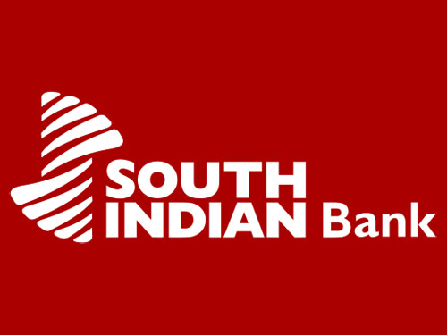
Brand: South Indian Bank
Owned by: The South Indian Bank Limited
Design: Unknown!
Design brief: ‘In the erstwhile logo of the Bank, the unique picture is that of a coconut tree. The fronds of the coconut palm form the basic theme of our new logo. The sharp ends of the fronds are smoothened, thickened and twisted to form a ‘S’ denoting South Indian Bank. Thus the new logo has the continuity from our erstwhile logo.
It can also be seen as two hands clinging to a strong pillar in the middle. The pillar is our beloved institution; the upper hand represents our customers and the lower hand symbolizes our staff members. “S” also projects a Safe, Solid, Smart, Strong, Secular, Shining, Schooled, Seasoned, Successful and Straightforward Bank.
The corporate colour is Cardinal Red. Red represents energy, creativity, warmth and love. With the new identity, we strongly pronounce our warm relationship with our customers.’
Logo release: 05 February 2007
Previous Logo:

A wrong Notion
Till recently, I thought that the South Indian Bank (SIB) logo represents a seashell as the bank is headquartered in Kerala which is famous for its pristine beaches. But no, the logo represents coconut tree leaves! The following is Kerala’s tourism logo that shows a coconut tree.

Hands together
The bank also claims that the logo can be visualized as a pair of hands. For me “a pair of hands” is either the erstwhile Air Deccan logo or the ubiquitous Life Insurance Corporation of India logo.

Till today, I am not able to find out the name of the SIB logo designer. If you happen to know it, please drop me a line.
From ‘bad’ to ‘worse’
A lot of Indian banks have redesigned their logo recently. Almost all of them have become better. We have already featured the design of Dhanlaxmi Bank logo. But there is this Syndicate Bank, whose logo — even after a redesign — is pretty worse.
Relevant link:



icarus design, bangalore done this identity