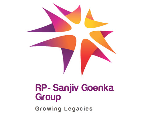
Brand: RP-Sanjiv Goenka Group
Owned by: RP-Sanjiv Goenka Group
Logo Designer: Design Law & Kenneth, Mumbai
Design brief:
“The new logo takes birth from an arrow head which personifies speed, progressiveness and focus. Six such arrow heads converge at a “common goal” forming the Dhanuchakra – the logo identity of the Group.
- This is an icon of focus and speed that drives every business.
- Of promises made and delivered.
- Of innovation that never ceases.
- Of legacy that has stood the test of time and future that we will create.
- This is the symbol of India’s youngest business group, born in 1820.
The logo and identity represent a young and vibrant business group focused on growth through sunrise industries. The values of dynamism, progressiveness and humaneness are imbibed in the logo.
The new identity was arrived at keeping in mind the various core businesses under the new group. The theme is ‘Convergence’: the six arrowheads symbolising the varied businesses converging around a single goal. Form, typeface and colour reflect the dynamism and vibrancy of the Group.”
Logo release: 13 July 2011
Previous logo:
Harsh Goenka now owns the above RPG Group Logo and Brandname.
Partition of Another Business Kingdom
Last year, the Indian businessman Rama Prasad Goenka announced that his industrial conglomerate RPG Group would be split between his two sons. The part given to his older son, Harsh, keeps the RPG brand name, while the younger brother, Sanjiv, would have to get a new name. Sanjiv’s company is called RP-Sanjiv Goenka Group and they have adopted this new logo. RPSG Group has a diverse portfolio, which includes retail chains, music publishers, a carbon black maker, power utilities and infrastructure.
The Vibrant Arrows
The new RPSG logo evidently conveys a vibrant spirit. I very much liked the ‘boomerang’ swoosh like arrows. Since they don’t have sharpened points, the feel is quite friendly. The colors are pretty good on the eyes. I liked the logo.
I think I’m suffering from an effect of Harabara font! I have already posted about the font in my previous blog post on Hero MotoCorp. For the new RPSG Group typeface, Digital Law & Kenneth has used Harabara font, with a minor tweak — they added a small ‘serif’ on the alphabet ‘a’ in the name “RP-Sanjiv Goenka Group.” But they have retained the original ‘a’ in the tagline “Growing Legacies.”
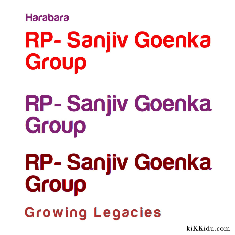
Click on the image for a more closer look. In the above image, the red colored RPSG Group is in Harabara font. I have overlaid it on top of the present RPSG logotype for comparison. Note the alphabet ‘a.’
Well-known RPG Brands
Following are some of the companies that are owned by the RPG Group. All of them are familiar to me for the past several years.
(Top) The erstwhile HMV India logo; (Bottom) The present logo of HMV Group.
During the 1990s, I had a collection of some popular RPG-HMV audio cassettes like ‘K J Yesudas Greatest Hits’ and Muhammed Rafi compilations.
In the year 2000, RPG-HMV was re-branded as Saregama India Limited.
Music World music stores owned by RPG are the first organized music retail stores in India. They have seen the transition from magnetic audio cassettes to Audio CDs, MP3 Audio CDs and now flash drives. Music World also sells music accessories.
Spencer’s Retail, RPG Group.

FoodWorld comes under Spencer’s Retail.
Converged Arrows
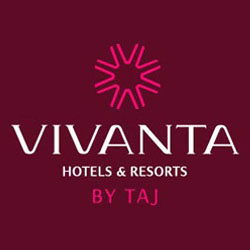
Vivanta Hotels & Resorts by Taj. Vivanta has eight ‘V’ arrows converging towrads a point.
I have seen some other logos too that feature converging arrows. But I am not able to locate them today. Watch this space for an update on such logos.
Relevant links:

Yet an another Logo with the Harabara font.