BRAND
Micromax
OWNED BY
Micromax Informatics Limited
LOGO DESIGNER
Creativeland Asia
Click here to download a high resolution logo.
DESIGN BRIEF
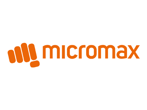
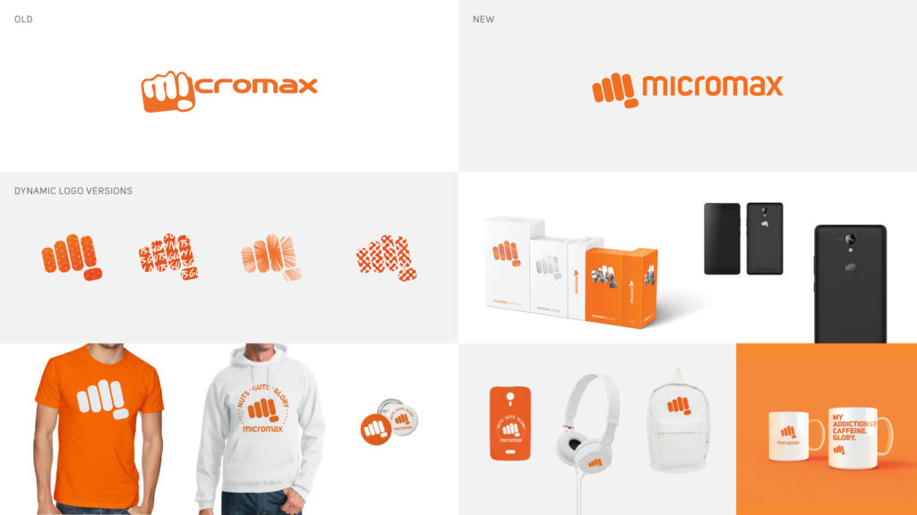
The new brand philosophy ‘Nuts: Guts: Glory’ is a re-articulation of Micromax’s DNA that underscores its pioneering status as company that has challenged accepted notions and brought market leading innovations to connect millions of Indians. The new brand identity presents Micromax 3.0 as a company that is bolder, modern, agile and armed with a winning attitude to take on the global smart devices market. The new logo is an evolution from the existing Micromax punch but a much more modernized version keeping in mind the global design language that appeals to the youth across the globe.
LOGO RELEASE
13 April 2016
PREVIOUS LOGOS
A punch in the face!

Whenever I see the Micromax logo, I’m reminded of our beloved Superman flying ‘up, up and away!’ Micromax is indeed a Superman among the rival mobile phone manufacturers as revealed by their sales numbers.

Micromax indeed delivered ‘the Matrix punch‘ in the face of many established companies by beating them in their own game. No wonder, their logo also depicts a clenched fist. The rebranding dropped the mobile phone from the clenched fist and conveys brand philosophy ‘Nuts: Guts: Glory.’

More Fists
I came across some very interesting punch/fist logo concepts while researching the Micromax logo. See this Abduzeedo page on ‘Logo Design: Fists.’




Relevant Links
- Micromax gears for the top spot as integrated Devices & Services company; undergoes brand refresh — Press Release
- Creativeland Asia: Micromax — The global revamp
- Creativeland Asia (CLA) redesigns the logo identity, crafts a new brand philosophy and creates a compelling integrated TV led campaign for Micromax
- afaqs!: “We don’t have a fruit for a logo,” shouts Micromax in a brand new spot
