Brand: Hero Motocorp
Owned by: Hero MotoCorp Ltd. (Formerly Hero Honda Motors Ltd.)
Logo Designer: Wolff Olins
Design brief:
“The new logo stands for the new face of India – that youthful energy and ‘can do’ spirit. It is in true sense the “Indian Catapult” which signals that while it is deeply rooted in Indian values, it is also poised to go for global expansion – a Leap of Faith.
The logo revolves around high energy and space. The colour red in the logo depicts continuity and change. It also depicts confidence. There is an ‘H’ formed in the logo. The angular formation of ‘H’ symbolises that Hero is no longer dependent on foreign expertise for its brands. It will be focussing on its own engineering capablities.”
Logo release: 09 Aug 2011
Previous logo:
A tiny dose of nostalgia
The first vehicle I bought in my life is a Hero Honda Splendor bike, with my savings from my first job, in 2003. Splendor has an image of dependable and fuel efficient motorbike. The other bikes available in the market were the newly launched Bajaj Pulsar and TVS Victor (backed by Sachin Tendulkar). Today I know that the first generation Pulsar had a lot of technical problems and the Victor had engine related troubles. My Splendor? I still drive it to my office everyday!
I first noticed Hero Honda while I was a student in the early 1990s through their ‘We care’ TVCs. Later they launched the iconic “Desh ki Dhadkan” (The Nation’s heartbeat) campaign in reply to “Hamara Bajaj” (Our Bajaj) campaign.
The new ‘Catapult’ logo
Before discussing the logo, let us talk about the new TVC. The updated slogan that comes with the new logo is “Hum mein hai Hero” (A Hero lives in us). The new ‘Hero Anthem’ TVC features our ‘Mozart of Madras’ A R Rahman.
Law & Kenneth created this TVC for Hero Motocorp. The new Hero website is created by Digital Law & Kenneth. Hero is leaving no stones unturned to convey that Hero Honda is now Hero Motocorp.
Regarding the new Hero logo, I must say that at least for now, I am not a fan of it. I don’t know, it may take some time for the logo to sink into me. The ‘H’ that is formed as part of ‘Closure’ technique is easy to spot. Although I have seen the word ‘catapult’ many times in the news related to this logo re-branding, I am failing to see its relevance in the logo.
One more thing that troubles me is the black triangle/arrow that is facing backwards (towards the left hand side). The other, bigger black arrow that looks forward is blunt; it has lost its sharp point. I’m waiting for the design brief from Wolff Olins when all the mysteries will be revealed.
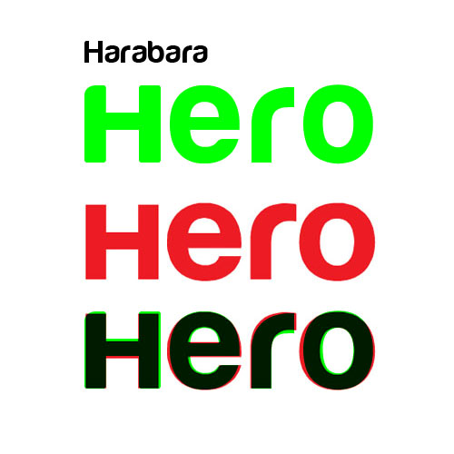
I have reasons to believe that the font used by Hero logotype is a variation of Harabara font. In the above image, the green colored ‘Hero’ is in Harabara font. I have overlaid it on top of the present ‘Hero’ logotype for comparison. Click on the image for a more closer look.
Did you miss the ‘H’?
The other day, one of my friends told me that he didn’t see the ‘H’ in the logo in the first attempt. It took him a while to ‘close’ the three shapes to see the ‘H.’ So I tried to analyze the logo as an isometric projection.
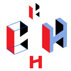
When I tried to generate a solid shape from the present logo, I found that the horizontal element of the ‘H’ is at an angle and it looks a little bit awkward.
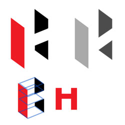
The above image shows how the logo will look if that inclination is corrected. The present logo is also given in monochrome for easy comparison.
Stylish ‘H’
Following are some logos that feature an ‘H.’
Hero Cycles is a part of Hero Motocorp.
The logo of The Shanghai Hero Pen Company who manufactures the hugely popular Hero pens.
Click here to know the design details of Havells logo.

Logo of Hilton Hotels & Resorts

Logo of Hindustan Motors, manufacturer of the ubiquitous Ambassador car in India.
Relevant links:

very bad logo. they should have retained the original. awefully terrible, the logo.
@Saumya:

I think that Hero was forced to change the old logo because, the black ‘H’ in the logo is the same ‘H’ that appears in the Honda logo.
The new video is directed by Anurag Kashyap.
Loved the moment when the boy throws the ball back at the jawan!
🙂
The Indian Catapult.
Well forget the logo… But Rahman’s song is catchy and rocks… Logo is nothing great… Another Gestalt theory example… Definitely can do better.
Sad Logo, Where is the new face of India?
What a logic of this logo! It’s shaking mind…
Beautiful Hero MotoCorp Ltd. Logo with lot of meanings. Its shows “Hum mein hai Hero” (A Hero lives in us) with a style. Good One…!! Big Clap to Hero Team.