
Brand: Airtel
Owned by: Bharti Airtel Limited that comes under Bharti Enterprises Ltd
Design: The Brand Union, London and JWT India
Design brief: ‘The new international identity has been specially crafted to appeal to a more dynamic & demanding audience. The unique symbol is an interpretation of the ‘a’ in airtel. The curved shape & the gentle highlights on the red color make it warm & inviting, almost as if it were a living object. It represents a dynamic force of unparalleled energy that brings airtel and its customers closer.
The specially designed logo type is modern, vibrant & friendly. It signals airtel’s resolve to be accessible, while the use of all lowercase is our recognition for the need for humility.
Red is part of airtel’s heritage. It is the color of energy & passion that expresses the dynamism that has made airtel the success it is today, in india, and now on the global stage.’
Logo release: 18 November 2010
Previous Logo:

This old Airtel logo was designed by Ray+Keshavan | The Brand Union, Bangalore..
3D rendering
The 3D version of the logo that appears in airtel website is the following.
It can be easily seen that the sharp edged ‘Airtel’ font does not go well with the curvy rounded logo.
Why a swirl?
Airtel has acquired Zain Africa’s operations in 15 countries. The following is Zain’s logo.
Zain may have influenced airtel’s new logo. For me, Zain logo is an ‘eye of a storm.’ I have seen the new airtel logo animated as a tornado in a couple of websites. The following screenshot is from Times Of India website (19-Nov-2010).

A confused JWT India on ‘Oirtel’
Recently, Times of India changed its masthead to include Airtel’s logo. This led to a huge embarrassment to JWT India who handles Airtel’s account. It is a common knowledge that the new logo is a stylized version of Airtel’s ‘a’ (Read the design brief above). Strangely, the alphabet ‘O’ in the ‘Times Of India’ masthead got replaced by the Airtel logo. That means, we are left with “Times ‘Af’ India” and “Oirtel.”
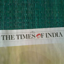
Image Courtesy: Biju Neyyan
On the ‘flip’ side…
The following screenshot is from Airtel’s website (13-Jan-2011). In the banner animation, a horizontally flipped Airtel logo appears.

Tip Courtesy: Yogee
Give me Red
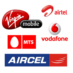
Red seems to be the favorite color in Indian Telecom sector. Vodafone, Virgin Mobile, MTS (Sistema Shyam TeleServices Limited), Aircel and Airtel are all using red color. So Uninor and Idea Cellular stand out from this red sea of hoardings in retail outlets.
Relevant links:


nice site. I think the logo type is weak though.
The Design was done by Brand Union. Brand Union is the company associated with Vodafone’s logo. I didn’t find it in their site but it was in one of the news snippets. Check out Brand Unions work
http://www.thebrandunion.com/OurWork
Yes, you are right. Brand Union has indeed designed the new Airtel logo. Technically, the old Airtel logo is also from Brand Union. Because Ray+Keshavan, Bangalore did that design. Now, they are a part of The Brand Union Network.
“Its awkward!” – BrandNew
“Split verdict for new Airtel” – Business Standard
A lot of people didnt like the Airtel new logo.
And many dont like their service too.
Also in their own website the logo has been flipped horizontally! See the flash in which a girl is holding the paper. Notice carefully and you will see flipped airtel logo in greyscale.
Leaves a very bad impression, but then who cares. They are doing good. 🙂
Thank you, Yogee. You do have a sharp eye. The following screenshot shows that you are right.
My mobile connection is Airtel. And I am waiting for the implementation of mobile number portability (MNP) in Bangalore to change to a new service provider.
Good and nice.