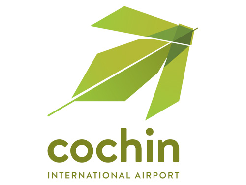
Brand: CIAL
Owned by: Cochin International Airport Limited
Logo Designer: Idiom Design and Consulting Ltd.
Click here to download a high resolution logo
Design brief:
“The ‘Navaswagatham’ identity indicates a parallel with Kochi and Kerala, suggesting the importance of integrating nature, culture and community for both the organization and the location it is situated. The logo is derived from the palm leaf – the ola – and its utilization as decoration through the thoranam in a flight like mode. It reflects the rootedness of the organization, the celebratory and welcoming nature of its culture and the greenness of its aspirations.
CIAL aims to become power neutral by 2016. The name reflects the new direction of the organization. The identity reflects this as well – the ascendance of the community, a celebratory and green culture for the organization as well as a responsibility towards greener skies for the planet.”
Logo release: 17 November, 2014
Kochi (KOC) and Kochi (KCZ)
CIAL is in Nedumbassery, Kochi, Kerala, India. It is usually denoted in travel booking sites as KOC. There is one more Kochi Airport (Kochi Ryoma Airport) in Nankoku, Kochi, Japan. Following is its logo.
Coconut Fronds and Palm Leaves
The CIAL logo is a very good one with an apt color palette. It is a refreshing logo that represents Kerala’s culture and a high flying flight.
A similar looking logo is:
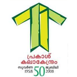
Prakash Kalakendram Kollam Golden Jubilee Logo 2008 designed by Binni.
We have already featured:

South Indian Bank logo inspired by coconut fronds.
Indian Airport Logos
We have already featured Kempegowda Bengaluru International Airport logo designed by Ray+Keshavan | The Brand Union.
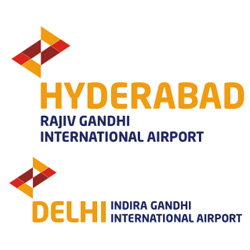
The two airports owned by GMR have similar logos of flying arrows. The color theme is inspired from the following GMR logo.
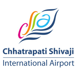
Chhatrapati Shivaji Mumbai International Airport Logo designed by Ray+Keshavan | The Brand Union.
Relevant links:
