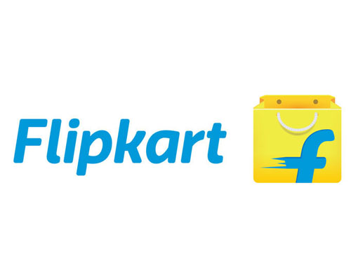
Brand: Flipkart
Owned by: Sachin Bansal and Binny Bansal
Logo Designer: Flipkart’s design team and Umbrella Design
Design brief:
The new design retains elements that denote our legacy of being a strong, authentic, trustworthy and fast brand. The contrasting colour palettes and the 3D design help the logo stand out across all touch points, whether it is desktop, mobile, online or offline.
The refreshed brand identity, including the new logo, is a reflection of our promise to our stakeholders – youthful, innovative, fast and reliable. While developing the new logo, we focussed on three key elements – one, the new identity had to create a positive perception about our brand; two, the logo needed to be more inclusive in its appeal to all our customers, and three, given our focus on the mobile platform, it had to stand out on the app interface.
The company has chosen to retain its signature yellow colour, as it represents qualities that Flipkart represents, like imaginative, lively, friendly and inclusive. The font used in the logo is Riona, which is contemporary but appealing to everybody. The shopping bag represents the freedom to choose products that a consumer likes.
Logo release: 28 May 2015
Previous logos:
 Read about this “shopping cart design” of 2011 here.


An Empty Shopping Bag!
Probably the bag is empty because it is waiting to be filled up.
This time, they got the speed lines correct! In the 2011 logo, the speed lines of the shopping cart depicted it to be moving from right to left, perceived as a negative direction. Now, the “f” on the shopping bag appears to be moving from left to right — positive!
 Incidentally, this is the ‘Fabmart‘ logo depicting an uppercase ‘F’ and a tilted ‘M.’
Now, let us look at some other designs that feature a shopping bag.
 Fulton Street Mall logo by Calori & Vanden-Eynden Design Consultants.
 Poqupaer.com logo designed by Levon Grigoryan.
 ‘Save Money India’ app by Dudhat Technologies.
 LocalShoals.com logo designed by Tammy Hart.
From Shopping Cart to Shopping Bag and a Wallet!
The 2011 logo design had the “f” as a handle of the shopping cart. In 2015, the “f” is painted on a shopping bag. It appears that Flipkart is going to paint the same ‘blue and speeding’ “f” on a variety of yellow objects.
 The ‘Seller Hub’ app features a yellow wallet with the blue ‘f.’ Fortunately, the wallet is not empty. It appears that it has either some photos or some blue cash!
Soon I’m expecting yellow trucks with blue ‘f’ plying in our cities!
Relevant link:


2 Responses
[…] Click here to read about the new logo […]
[…] Click on the above image or here to read about the new redesigned logo of Flipkart. […]