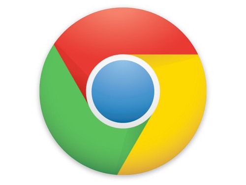
Brand: Google Chrome
Owned by: Google Inc.
Design: Google Chrome designers including Steve Rura, Micheal Lopez…
Design brief:
“Since Chrome is all about making your web experience as easy and clutter-free as possible, we refreshed the Chrome icon to better represent these sentiments. A simpler icon embodies the Chrome spirit — to make the web quicker, lighter, and easier for all.
Redesigning the icon was very much a group effort. Collectively, we explored many variations, tried the icon in several different contexts, and refined the details as we moved along. It was important to maintain consistency across all media, so we kept print, web, and other possible formats in mind. Once we arrived at a good place, we finished up the icon by resizing, pixel-pushing, and getting everything out the door.”
Logo release: 21-Mar-2011
Previous Logo:
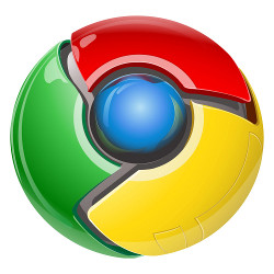
Idea behind the Chrome orb icon
Nowhere I have seen an explanation to the original Google Chrome ‘orb’ icon that was introduced in September, 2008. My assumptions are these:
- The orb like icon stands for a button that invites us to click on it.
- The orb icon appears as if it rotates in clockwise direction just like ‘loading…’ animation in web browsers. This gives out the perception of ‘speed.’
- The colors — green, yellow, red and blue are inherited from Google logo.
When I first saw this icon, two images came to my mind instantly.

Windows Media Player 11 icon
Windows Security icon
Now, Chrome icon is simpler
I liked the evolution from a futuristic hi-fi orb icon to a more contemporary and simplified form. Although the new version looks flat compared with the original, on closer inspection, one can see the subtle highlights and shadows denoting a very friendly shape.
Relevant links:
