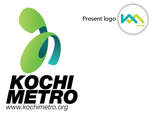
Click on the above image or here to read about the new redesigned logo of Kochi Metro.
Brand: Kochi Metro
Owned by: Kochi Metro Rail Ltd. (KMRL)
Logo Designer: Shajin Paikath (Idiom Design and Consulting)
Design brief:
Kochi Metro is one of the change-inspiring developments in Kerala, which paints the new dynamic face of the state. Inspired from the first consonant of Malayalam language, the letter ‘ka’ has been used as a representation of the highly literate state. ‘ka’ also is the first letter of Kochi and Kerala.
The logo has been crafted in a new-age, fast, fluid and lively avatar. The form is nimble which connotes a young, electric and an energetic visual presence. The form is charismatic implying speed, smooth movement which is synonymous to the metro itself.
The colours green and blue are inspired from Kerala’s natural beauty… the green trees, mountains, blue sky and the sea. The green and blue rendition is the Kochi Metro’s commitment towards environment sustainability and Kerala’s renowned eco-friendliness.
The name ‘KoMet’ (Kochi Metro) is no longer used.
Logo release: July 2012
A ‘Ka’, looking like a ‘Tha’
It is a unique logo as it features the alphabet ‘ka’ from Malayalam language. It is converted into a minimal graphic. At one angle, one can argue that, the logo resembles more to “tha’ alphabet. The blue and green surfaces of the strip is rendered beautifully in 3D. This logo has a great potential considering the design of marketing collateral.
At the time of writing, it is well-known that a new name and logo will be released soon, designed by TATA ELXSI Limited. Keep visiting this page for the update.
Let’s hope that the new logo will be even better than the present one.
A Feast to the Eyes
Kochi Metro logo is the prettiest among the other Metro rail logos in India. See the other logos and decide yourself.
 Bengaluru
 Gurgaon
 Mumbai
 Chennai
 Delhi
Delhi
 Ahmedabad & Gandhinagar
 Lucknow
 Kolkata
Relevant links:

Very interesting information about Kochi Metro logo.
KoMet is my personal favorite, as it conveys the speed of a comet and abbreviation of ‘Ko’chi ‘Met’ro.
I think the name KoMet is suggested by Malayala Manorama, they had a competition for this long ago.
Waiting for the new logo…
Thanks for writing in.
Yes, you are correct — Malayala Manorama came up with ‘KoMet’ after a competition. I got the following from a Google Search.
I very strongly disagree. I think Bangalore’s Namma Metro logo is the most well designed and well thought out logo. The rangoli logo which shows the line passing around the dots basically defines the very intent of the metro – connecting people with various parts of the city. North, East, West, South and the Centre. None of the other logos including the Kochi logo can boast of this beautiful message envisaged through the logo itself.
Thanks for writing in. I didn’t know about the design logic of Namma Metro logo. It appears that there is a scope for another blog post.
Delhi Metro is the only good looking branding we have. Rest all just waste of money and oldschool design. India really needs a design quality control system.
This Logo is designed by Shajin Paikath. Not Raji or Sijo/Riyas.