Brand: Punj Lloyd
Owned by: Punj Lloyd Ltd.
Design: Ray+Keshavan | The Brand Union
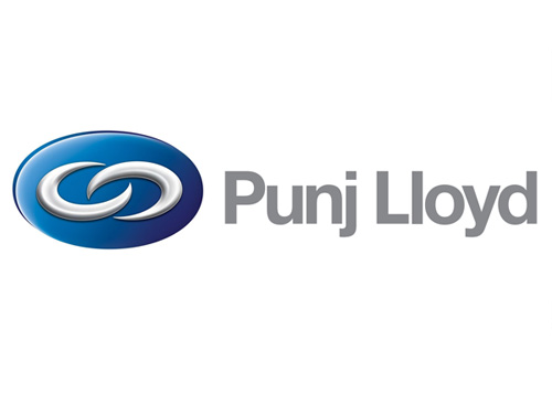
Design brief: ‘The logo shows two links enclosed in a 3 dimensional ellipse. Based on the idea of synergy – different entities working together to create a whole that is larger than the sum of its parts – the two links represent the strong relationships between the different companies within the group, as well as the enduring relationships that Punj Lloyd shares with its many stakeholders.
The vibrant blue of the logo depicts stability, safety and scale. The vignette in the blue represents the natural elements of the environment like air and water – symbolizing the commitment of Punj Lloyd to the environment and its consistent efforts to protect it.
Using Helvetica Neue as its typeface, the logo projects to the viewer a crisp, clear letterform and a modern character. ‘
Logo release: December 2006
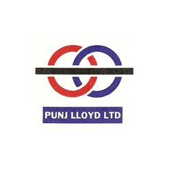
Previous Logo:

This is what I found on my shampoo bottle. And I am sure that this is just a coincidence!

Relevant link:


I think it resembles Ford logo.