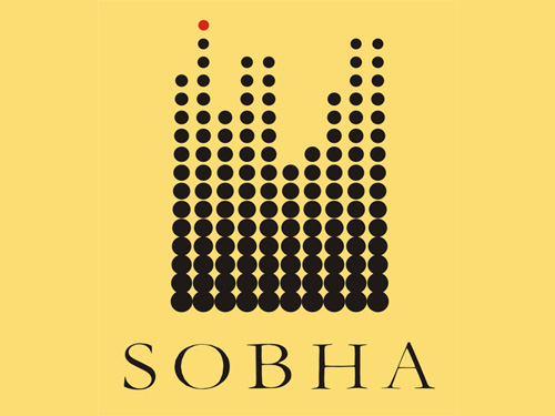
Brand: Sobha Developers
Owned by: The Sobha Group
Logo Designer: Unknown!
Design brief:

“The ratio of the ‘golden rectangle’ in mathematics, is one of the most desired proportions in the construction arena. The background of the Sobha logo is designed to come very close to the golden rectangle ratio. The elegant rectangle represents ‘balance’ – reflection of the solid foundation and durability that our creations offer. The yellow background signifies ‘energy’ and ‘optimism’, traits well engrained in every Sobhaite.
The black dots represent the state-of-the-art technology we employ in all our operations. The red dot at the top is symbolic of being ‘auspicious’ and represents the ‘pinnacle of success’ – a sign of our continuing quest for perfection.”
Logo release: Circa 1995
The red dot
I never gave a second thought to the Sobha logo as I always considered it as a representation of a skyline in halftone. One day, I was waiting for a bus and I saw a huge Sobha logo on an apartment building nearby. Then, for the first time, I noticed the red dot on the top. I thought “Wow! the logo designer even thought of representing a warning red light on the top of a skyscraper!”
Needless to say, my attempts to know the identity of the designer only resulted in a lot of junk e-mails and phone calls from the Sobha Group announcing their latest and upcoming projects! They think that since I am interested in their logo, I am also a prospective customer.
🙂
More Buildings

Read the story of Brigade Group logo here, in kiKKidu.com.

Modern Committee, Los Angeles Conservancy
Relevant link:



1 Response
[…] have already discussed some logos featuring buildings in Sobha Developers page in this blog itself. So I’m not going to repeat […]