Brand: Wipro
Owned by: Wipro Limited
Logo Designer: Landor India
Click here to download a high resolution logo
Design brief:
The new logo represents the way Wipro “connects the dots” for its clients: integrating deep technology and domain expertise, applying insights from across industries, and consistently delivering world-class integrated, end-to-end capabilities and services. The logo also highlights Wipro’s strong technology heritage and reflects its capabilities for the future.
The styling of the brand mark gives it a sense of fluidity, resourcefulness, optimism and a connected world.
The individual elements in the logo represent ideas, insights, technologies, industries and geographies. The expanding pattern symbolizes a boundless Wipro. The four circles represent the Wipro Values, Employees, Clients & partners, and Communities. The blue of the word mark creates a sense of reliability and authority.
Along with its new identity, Wipro has also rearticulated the Spirit of Wipro, its core values: Be passionate about clients’ success, Treat each person with respect, Be global and responsible, and Unyielding integrity in everything we do.
Logo release: 02 May 2017
Previous logo from 1998

Connecting the Dots
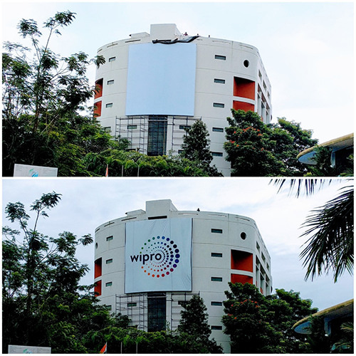
The old logo was a classic example of “how not to design a logo.” The multi-colored, highly detailed sunflower logo didn’t work in small sizes, didn’t work as favicons on screens, didn’t work on greyscale print and it was a costly affair to print in color.
Did the new logo solve all the above issues?
Sadly, no. The new logo is definitely an improvement from the old one; but it is not there yet.
Forget printing and small sizes; is the new Wipro logo a unique one?
Well…
Similar Logos

Reuters news agency and its parent Thomson Reuters are using the above logo since 2008 designed by Interbrand. The design brief says “the company is advancing to become a truly connected enterprise, where capabilities are shared, technologies are integrated, and clients’ needs are met holistically.” Just like the Wipro logo, this logo also has four concentric rings of dots.
‘The O2 Arena’ (North Greenwich Arena) is a large entertainment district in London, UK. This logo has five concentric rings of dots!
Following is the logo animation.
This is an old logo of Visteon Corporation, an American global automotive electronics supplier that spun off from the Ford Motor Company in 2000. This logo has a perspective view rather than the other logos’ planar view.
Did you count? They have five concentric, incomplete rings of dots!
Relevant links:
Nice insights. Can’t believe nobody at Wipro said “this reminds me of….Reuters!”
We call it the ‘in and out’ strategy. Get in and get out before the client figures it out! Landor aced it! 😉