
Click on the above image or here to read about the new redesigned logo of Flipkart.
Brand: Flipkart
Owned by: Sachin Bansal and Binny Bansal
Logo Designer: MediaShala
Design brief: Not Available
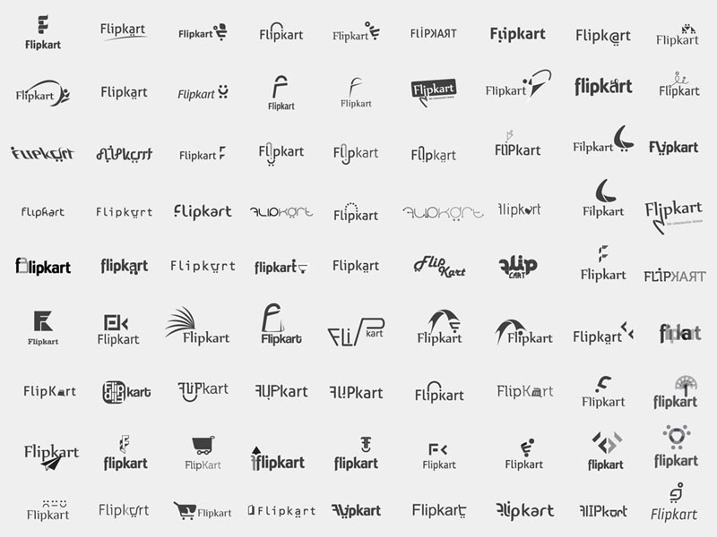
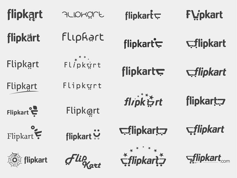
Following images are logo explorations as seen at MediaShala’s portfolio.
Logo release: January 2011
Previous logos:


Go-Cart!
Fipkart blog says that “In terms of design, we bid farewell to the beloved orange and welcome in a sharp, some say more professional, yellow and blue motif along with a spiffy new logo – shopping kart, speedy delivery et al.”
We have contacted MediaShala for the design brief of the new logo, just waiting for the reply.
When something is shown moving or advancing in a logo, generally they are directed from left to right to represent a positive direction. One example that comes to my mind instantly is the Skoda logo.

The flying arrow is shown pointing from left to right in a ‘forward’ direction. It is interesting to note that the shopping cart in Flipkart logo is shown moving in ‘reverse’ — from right to left. I wonder why? The oblique font is a nice touch that again shows a ‘dynamic,’ ‘unsettled’ brand.
Flipkart Logo Attempt By Aside Brands
Recently, I stumbled on to an April 2012 blog by Naina Redhu on her attempt of designing Flipkart’s logo in December 2010.

Click on the image to read the interesting story at Aside Brands’ Blog.
Other ‘Cart’els
Following are some of the logos featuring shopping carts.
Google Checkout logo features the silhouette of a cart.

VirtueMart is an Open Source E-Commerce solution to be used together with a Content Management System (CMS) called Joomla!.

X-Cart is another shopping cart software.
Acknowledgements
I would like to thank Deepansh Agarwal of Aim High Consulting for helping me to identify the logo designer.
Relevant links:


2 Responses
[…] Read about this “shopping cart design” of 2011 here. […]
[…] Read about this “shopping cart design” of 2011 here. […]