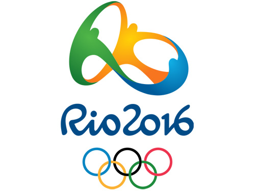
Brand: 2016 Rio De Janeiro Summer Olympics
Owned by: International Olympic Committee
Design: Tatil Design
Design brief: ‘We selected a simple yet powerful idea as our inspiration: what distinguishes Rio city and makes the Olympic Games a truly grand event are the people, their nature, their feelings and dreams.
That’s why we created a truly human brand.
The natural beauty of our landscape is embodied by the brand and its color palette. Yellow symbolizes the sun and our warm, vivacious and happy nature. Blue expresses the fluidity of the water that surrounds us, and our easygoing way of life. Green represents our forests and hope, a positive vision that inspires us to go even further.
Together, different countries, athletes and peoples embrace in an individual and collective motion that reveals one of our city’s landmarks — a vibrant Sugarloaf, pulsating with joy, union, celebration and friendship.’
Logo release: 31 December, 2010
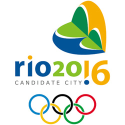
Previous Logo

This logo was designed to bid for the 2016 Olympics. Ana Soter designed this logo and this was unveiled in December, 2007.
The logo uses a stylized Sugarloaf Mountain in the shape of a heart to represent Brazil’s passion and enthusiasm for sports. With the slogan, “Live your passion,” Rio’s logo also features an exclamation point replacing the ‘1’ in ‘20!6’ symbolizing the excitement of the games.
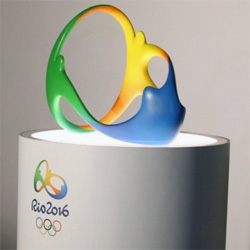
3D Version of the logo

I liked the 3D rendering of the logo. I am sure that the event will feature prominent versions of this 3D logo.
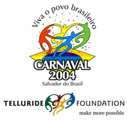
Similarity with other logos
I don’t think that the Rio Olympics logo is copied from something else. Because humans forming a ring is not a new idea and thousands of people have used the concept. Following are some of the samples.


Relevant links:
Nice Catch Bro..